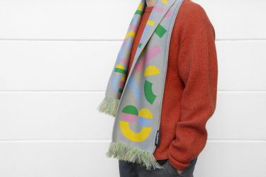
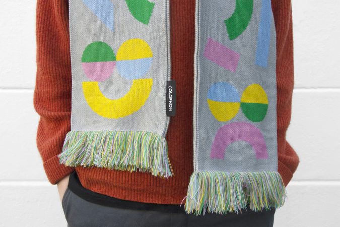
Custom multi-coloured knitted scarves with Pep specimen on both sides, made using five colours of soft acrylic yarn. Get yours here while supplies last! 1475mm x 215mm 1595mm including the fringes Soft acrylic yarn Light gray, pink, yellow, green and baby blue Edition of 100

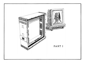
An illustration of a train designed and used during the testing and production of the typeface.

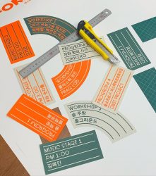
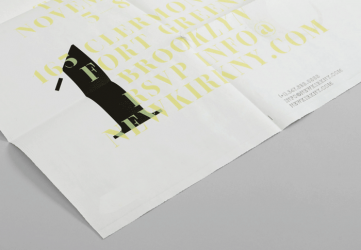
REST FOREST 2019. Festival Identity Design Design: Kimgarden (Yunho Lee, Kangin Kim & Daesoon Kim) in collaboration with Zero-Lab

Custom multi-coloured knitted scarves with Pep specimen on both sides, made using five colours of soft acrylic yarn. Get yours here while supplies last! 1475mm x 215mm 1595mm including the fringes Soft acrylic yarn Light gray, pink, yellow, green and baby blue Edition of 100
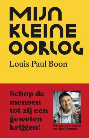
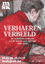
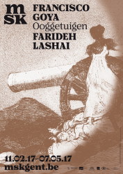
Re-issue of the cult Flemish classic “Mijn Kleine Oorlog” by Louis Paul Boon. Designed by Studio Luc Derycke and published by Borgerhoff & Lamberigts
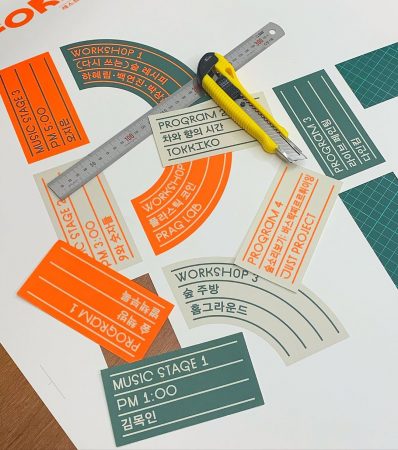
REST FOREST 2019. Festival Identity Design Design: Kimgarden (Yunho Lee, Kangin Kim & Daesoon Kim) in collaboration with Zero-Lab
Custom multi-coloured knitted scarves with Pep specimen on both sides, made using five colours of soft acrylic yarn. Get yours here while supplies last! 1475mm x 215mm 1595mm including the fringes Soft acrylic yarn Light gray, pink, yellow, green and baby blue Edition of 100
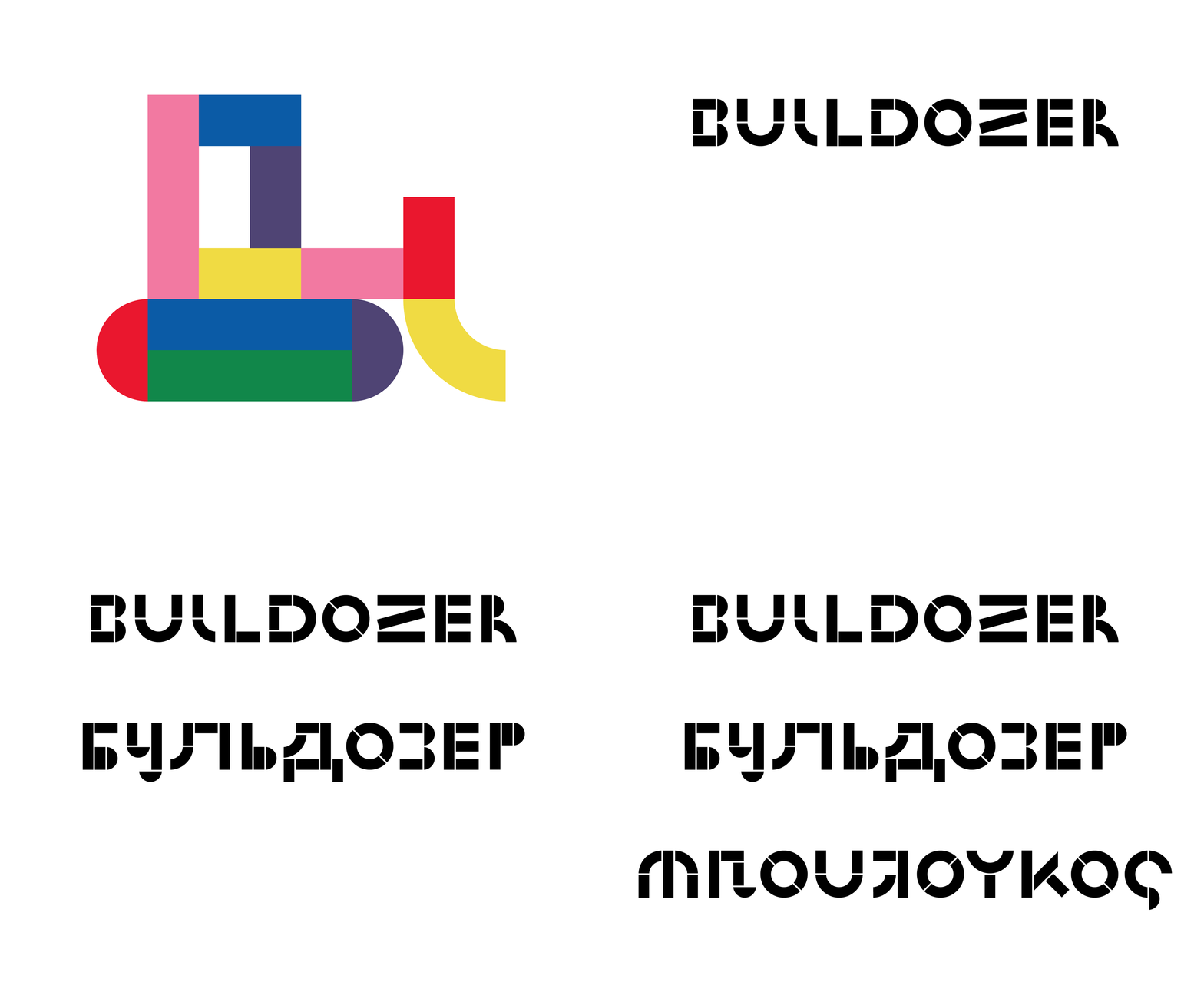
Pep has a lot of pep. It is loosely based on a series of experimental designs ranging from the 1920’s like Fregio Mecano and Futura Schmuck until the 1960 rendition by Bruno Munari: ABC Con Fantasia. Whilst the UPPERCASE of Pep can be traced back the latter. The entire typeface takes the six geometric elements much further.
↓ MORE INFO ↓Through-out the design process, Dries tried to find the extremes within said “rules”. This process resulted in a mixed case type system, even extending into experimental Cyrillic and Greek lettering.
Pep is a typeface that can easily add playful flair, but also balances with restraint and confidence. Experiment with colours! Stylistic alternates! Break the forms! But, apply and utilise playfully at all times.
In the words of Devo:
Vigor, vim, vitality and punch
The ability to act on a sudden hunch
Nerve to tackle the hardest thing
Feet that climb and hands that cling
A heart that never forgets to sing
That’s Pep
© Devo, Mark Mothersbaugh, 1980
Pep Solid Classic
Pep Solid Pastel
Pep Solid Hot
Pep Solid Cold
Pep Solid RGB
Pep Solid Grey
Pep Solid Black
Pep Shapes Classic
Pep Shapes Pastel
Pep Shapes Hot
Pep Shapes Cold
Pep Shapes RGB
Pep Shapes Grey
Pep Shapes Black
A list of all fonts that are available, either as retail fonts or béta licenses on demand:
- DateNameOutletState
- 2023 Cru Colophon Foundry Retail Font
- 2019 Pep Colophon Foundry Retail Font
- 2019 Nib Colophon Foundry Retail Font
- 2017 Mad Serif Colophon Foundry Retail Font
- 2017 Mad Sans Colophon Foundry Retail Font
- 2010 PDU Colophon Foundry Retail Font
- 2008 Ultra Black N/A Unpublished Béta
